La Société des calligraphes de Montréal
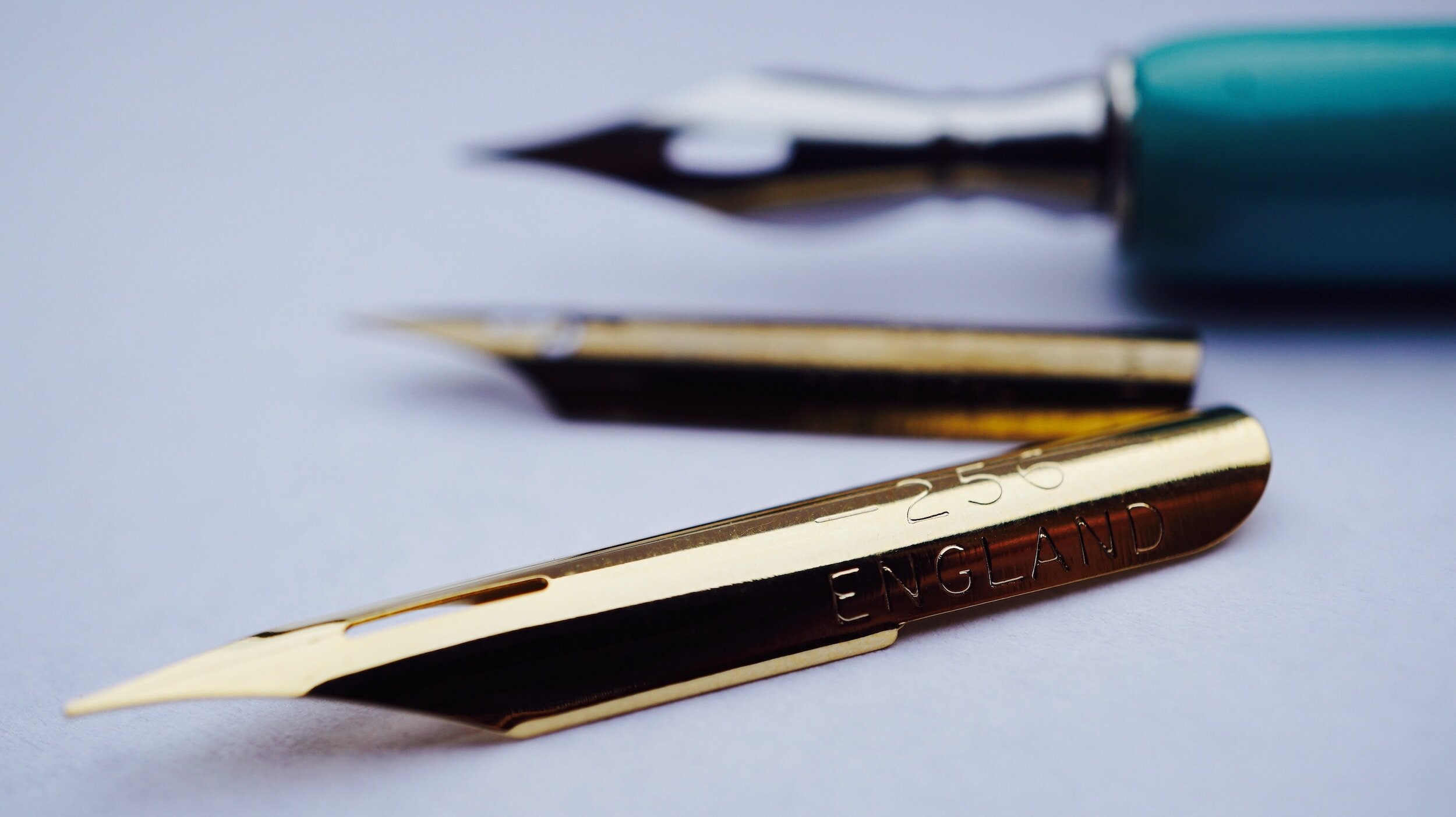
Nous sommes un organisme à but non-lucratif qui regroupe les calligraphes professionnels et amateurs de diverses régions du Québec. Nos activités se déroulent principalement à Montréal.
Adhérer à la Société ⟶
Prochaines réunions
-
Rencontres des membres (virtuel)
EN VIRTUEL
Les membres se rencontrent généralement le troisième mercredi tous les deux ou trois mois, de septembre à mai, à 19:30. Les prochaines rencontrent auront lieu via Zoom. Le lien pour la rencontre virtuelle est envoyée dans l’infolettre réservée aux membres de la Société, quelques jours avant la rencontre.
PROCHAINES RÉUNIONS:
• Mercredi 21 février 2024, 19h30 à 20h30
• Assemblée générale annuelle : mercredi 15 mai 2024, 19h30 à 20h30
-
Soirées calligraphiques (en personne)
Centre communautaire Monkland (Google Maps)
Venez faire de la calligraphie et discuter avec les membres de la Société! Amenez vos travaux en cours et vos plumes préférées. Ce sera l'occasion de travailler sur des pièces, échanger, discuter, partager, tous ensemble. La Société fournira des grignotines et des rafraîchissements.
PROCHAINES RÉUNIONS:
• 10 Janvier 2024, 19h00 à 21h00
• 15 février 2024, , 19h00 à 21h00
• 13 mars 2024, 19h00 à 21h00
• 10 avril 2024, 19h00 à 21h00
• 8 mai 2024, 19h00 à 21h00
Prochains ateliers

Prochains événements